What if digital bibles took inspiration from software development?
![]() Jan 2024
Jan 2024
Following on from this previous post, a few weeks(!) ago, I had the opportunity to explore some possible ideas for digital bibles at the Kingdom Code BUILD (hackathon).
It was a great opportunity to meet and discuss ideas with a large group of people and also be introduced to many bible formats and versions I hadn’t seen before. Fortunately (or not?) no-one was able to say they were aware of anything like what I was imagining.
The vision
The first big challenge was trying to explain my vision.
Talking with many developers, they quickly found tangents and were distracted by offshoot ideas once the concept of combining the experience of developing software and reading the bible were mentioned. These people may have come up with many brilliant ideas and some of them indicated that they would explore them further themselves, but these missed the vision I was trying to communicate.
Eventually, I came up with this way of describing it:
It’s possible to work with code in a very basic text editor, but it’s much easier to work with code in a specialist IDE because of all the dedicated tools and features there. Reading a digital bible feels like the equivalent of working with code in Notepad. What does the IDE equivalent look like?
We then spent the rest of the hackathon exploring concept ideas to try and gain further feedback.
A Disclaimer
This is not a criticism of (all) existing digital bibles. They are useful, valuable, and often better than their paper equivalents.
This is all part of an attempt to explore this idea that IDEs have tools and features intended to make the text (code) easier to read, understand, explore, cross-reference, see connections, etc. What if we took some of those tools and applied them to the bible?
It’s not that there’s anything wrong with the digital bibles that exist today but rather an observation that they could be (doing) more.
Concepts
The following images are from the brief presentation shown at the end of the hackathon. The intention of participating the hackathon was to show some of the ideas, and to see what interest, thoughts, and feedback people had about them.
Due to the time constraints of the event, we didn’t try to make anything that worked, we simply created mockups and visualizations of concepts to show how things might look. We didn’t make any requirements or decisions about the technology to use to build any final product/tool/experience and didn’t want to make any limitations on where such an experience would run, be it in a browser or an app, or on a certain type of device.
The images are also to show intentions and possibilities. The goal was not to show any final graphics or visuals, only concepts.
There may also be subtle details in some of these images that aren’t fully explained. Don’t worry if you miss them, we knew why they were added when we created them.
The basics
There are, obviously, a few basic things that any such experience (app or website) should provide. These aren’t specific to the inspiration from software development but I include them here for completeness.
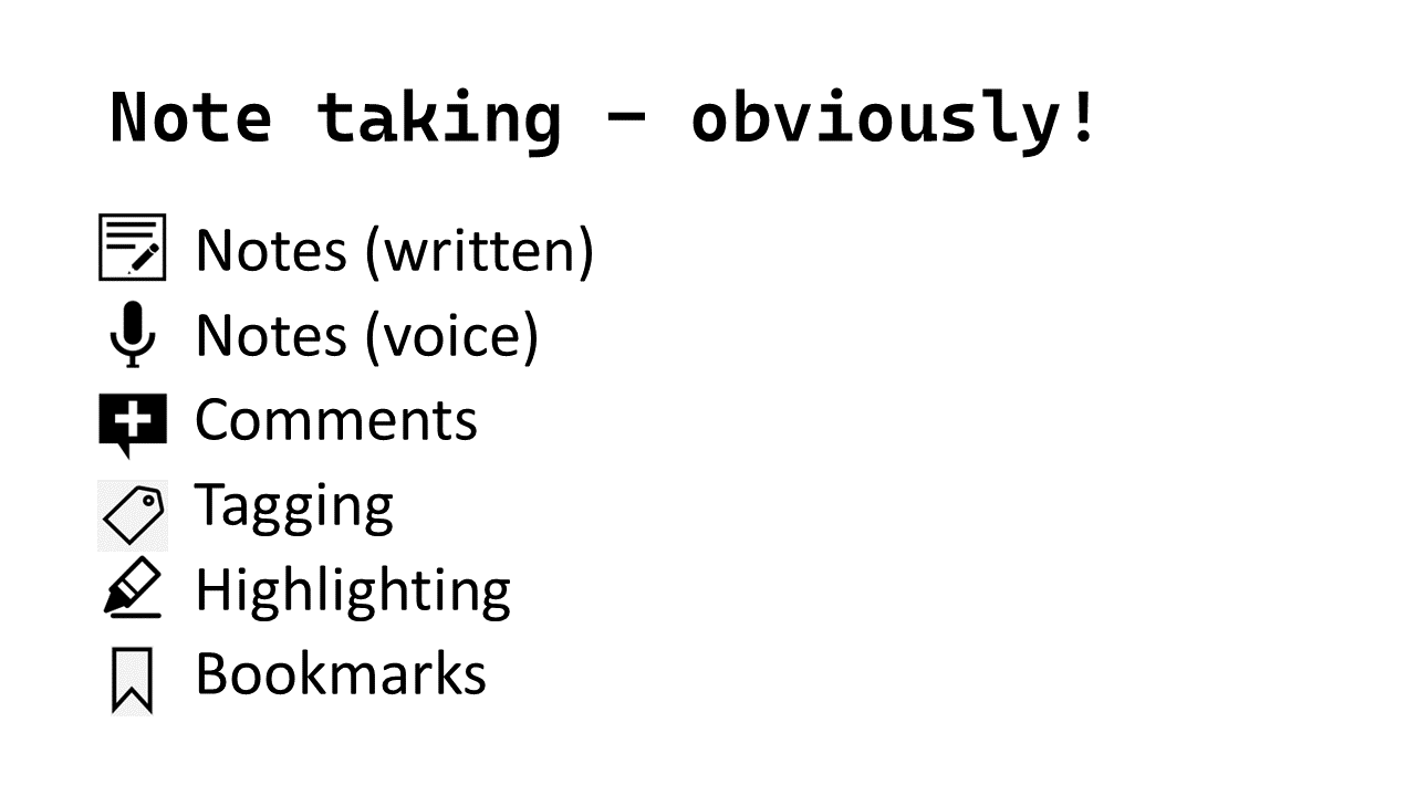
- Take Notes (in various ways and forms)
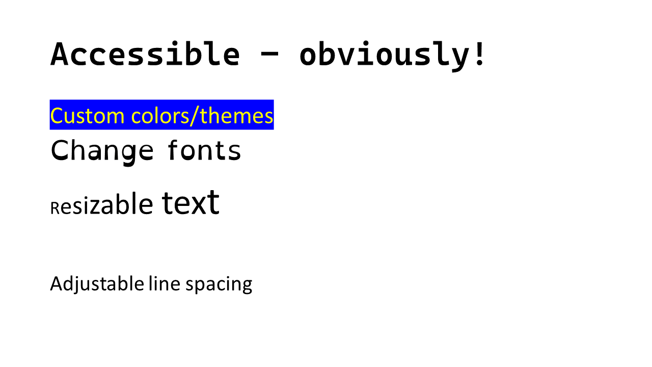
- The text should be accessible for all
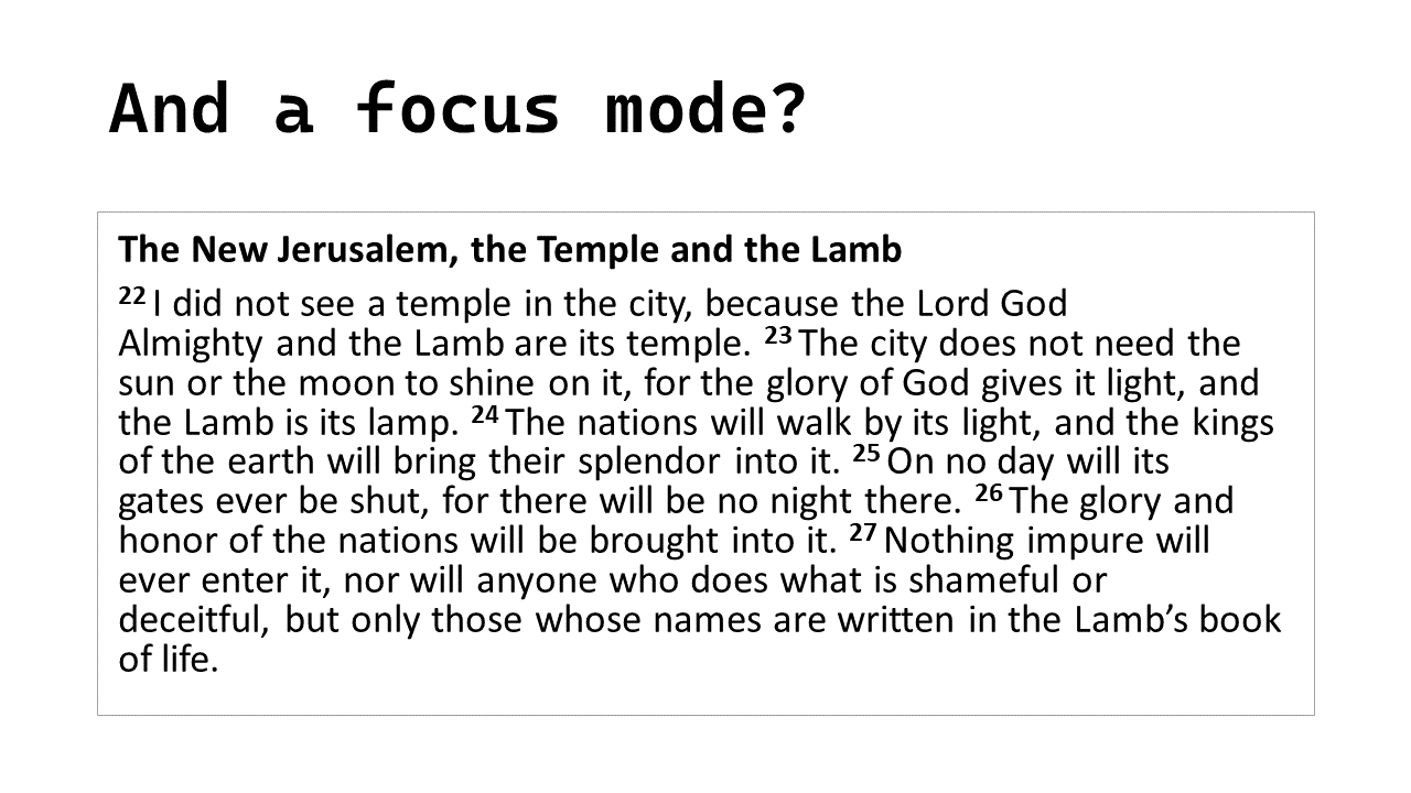
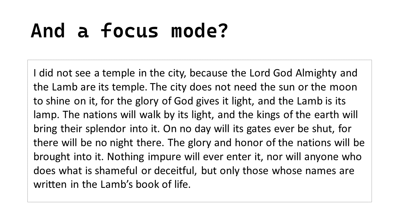
- Include a “focus mode” (possibly?)
So that annotations, verse numbers, headings, etc. are removed so it can be easier to read.
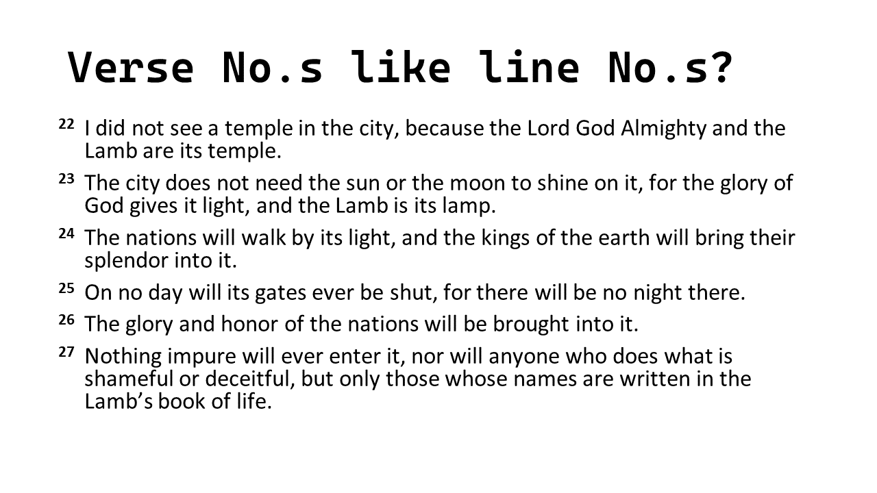
- Separating verses and numbering at the side
A bit like having line numbers in code
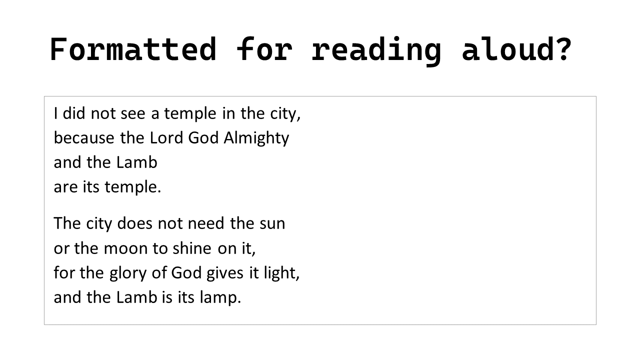
- Formatted for reading aloud?
As “scripture is a script” why not format it so that it is easier to read aloud without stumbling over long sentences by encouraging pauses at line breaks that fit with the text, rather than being dependent on when the line is forced to wrap by the width of the page (or column.) Noting that this can also be useful for accessibility too.
Highlighting
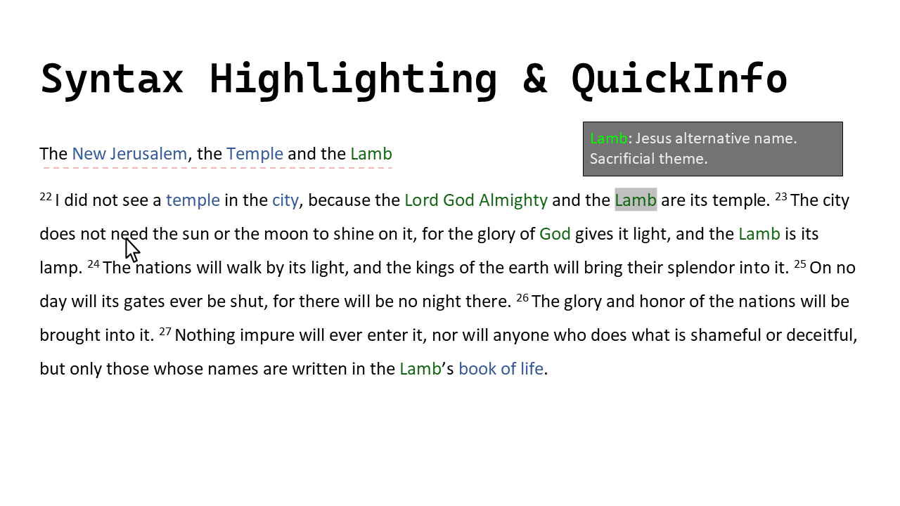
One of the obvious differences between looking at code in an IDE and looking at most other text is the coloring and highlighting seen when looking at code. What if we applied such highlighting to the biblical text?
Some or all of the following may be appropriate/useful.
- Highlight key terms
And show appropriate related details when moving the cursor over (or focus onto) these terms.
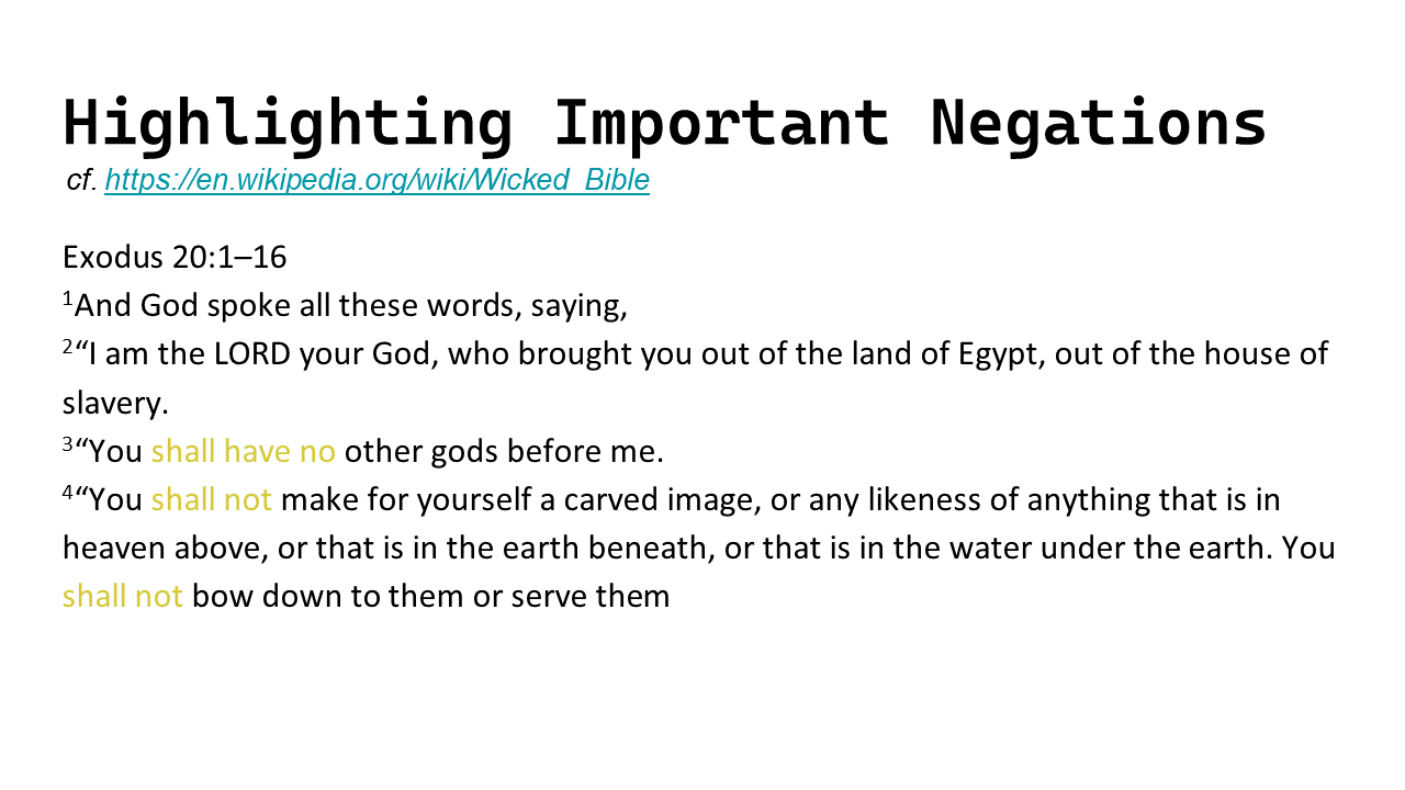
- Highlight negatives (and positives)
Because it can be critical to not get these wrong. Both when they’re instructions and when they’re part of a narrative.
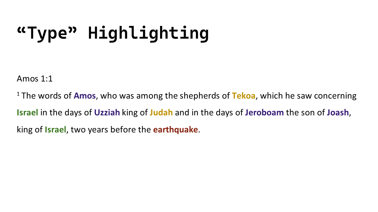
- Highlight to distinguish between words
That name you don’t recognize, would it help if there was something distinguishing between a person, a place, and a group of people?
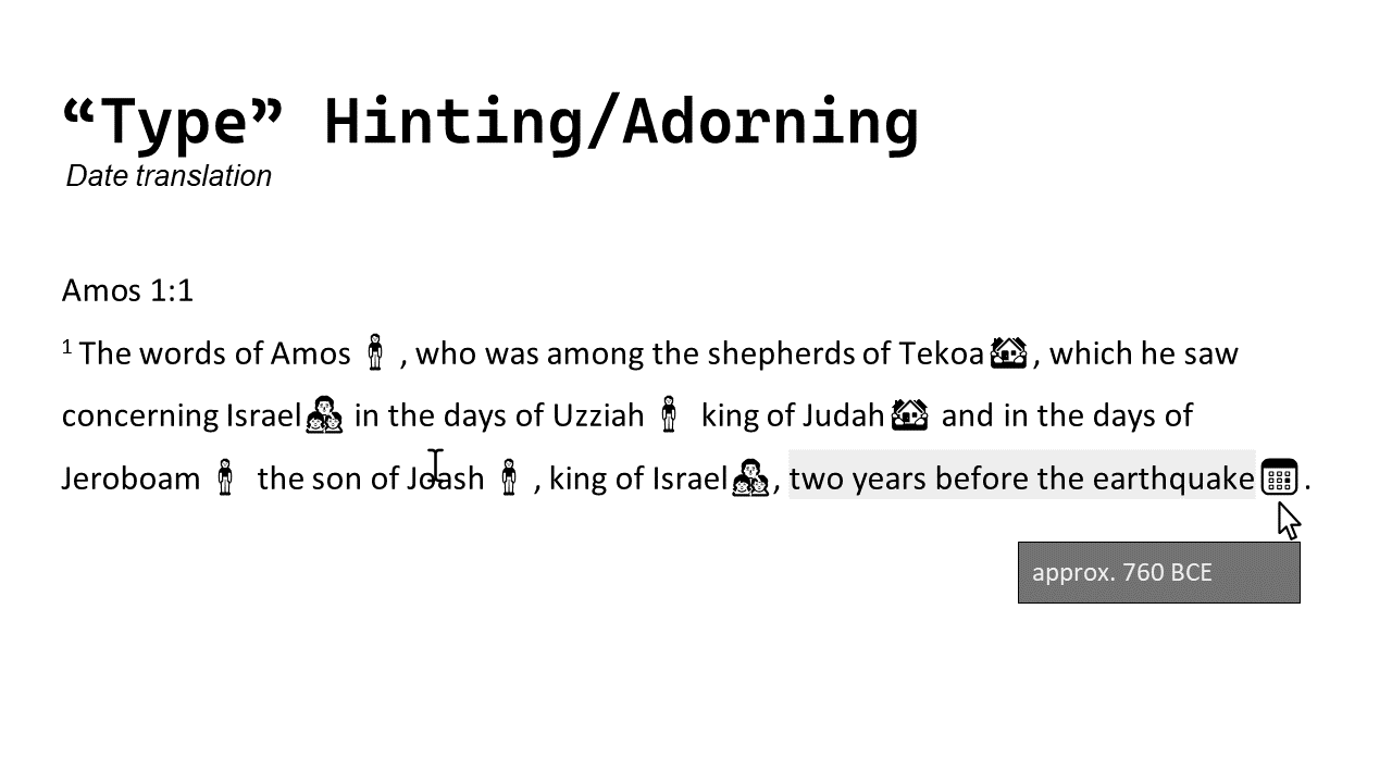
- Adding icons within the text
Maybe color isn’t sufficient to distinguish things accordingly. Maybe an icon (or image) next to a word would help make it clear what a name represents.
Or, for an event this could also be a way to indicate that more information is available.
- Referencing maps and images
The location of places or areas isn’t always known by modern readers. If naming a place, why not also show it on a map? If the text mentions a journey between two places, why not show them both, with a scale and details of approximate journey times?
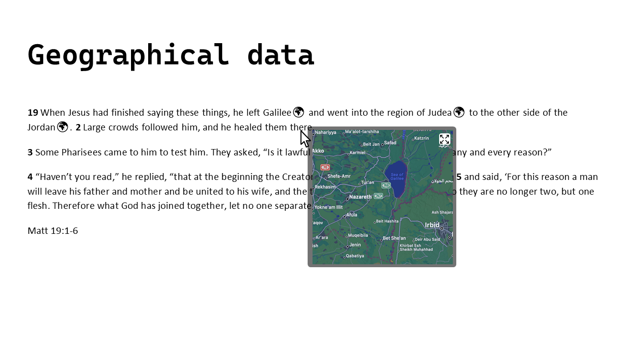
This isn’t a great example of a map that adds clarity, but hopefully shows how it could be referenced or shown relative to the text.
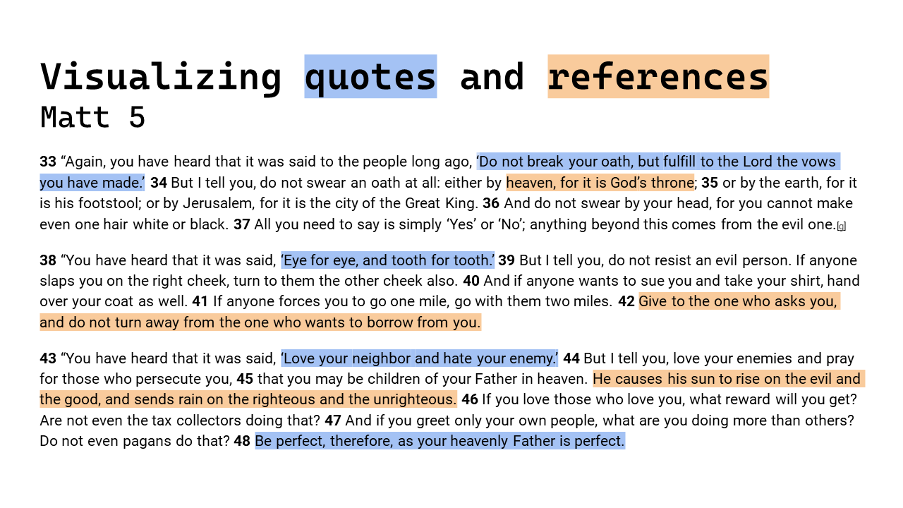
- Make quotes and other references clearer
Where there is text that is a quote from or repeated elsewhere, might it be useful to know this? Is there a concept in this piece of text that is repeated elsewhere or has more details or notes available, would it be useful if this was made obvious to you as a reader so you can explore and investigate accordingly?
- Show connections between parts of a text
To make it clear how the different parts relate or are connected.
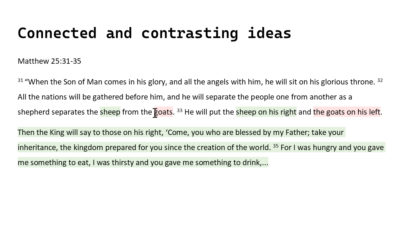
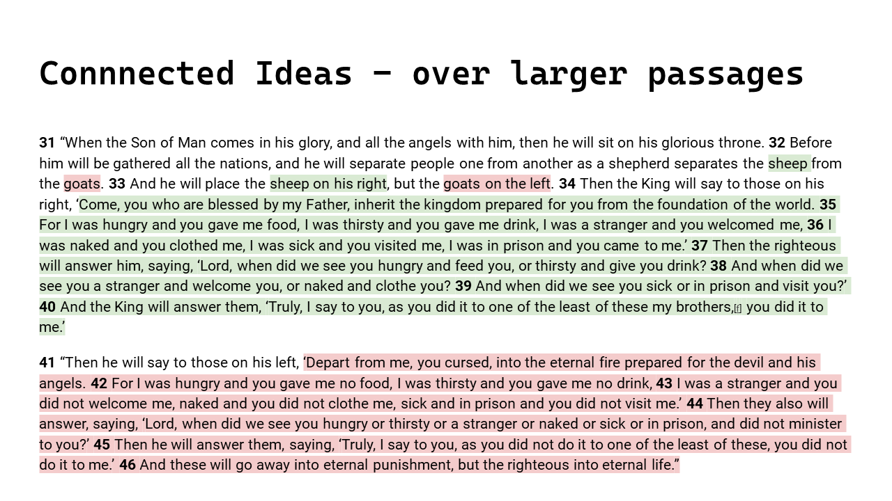
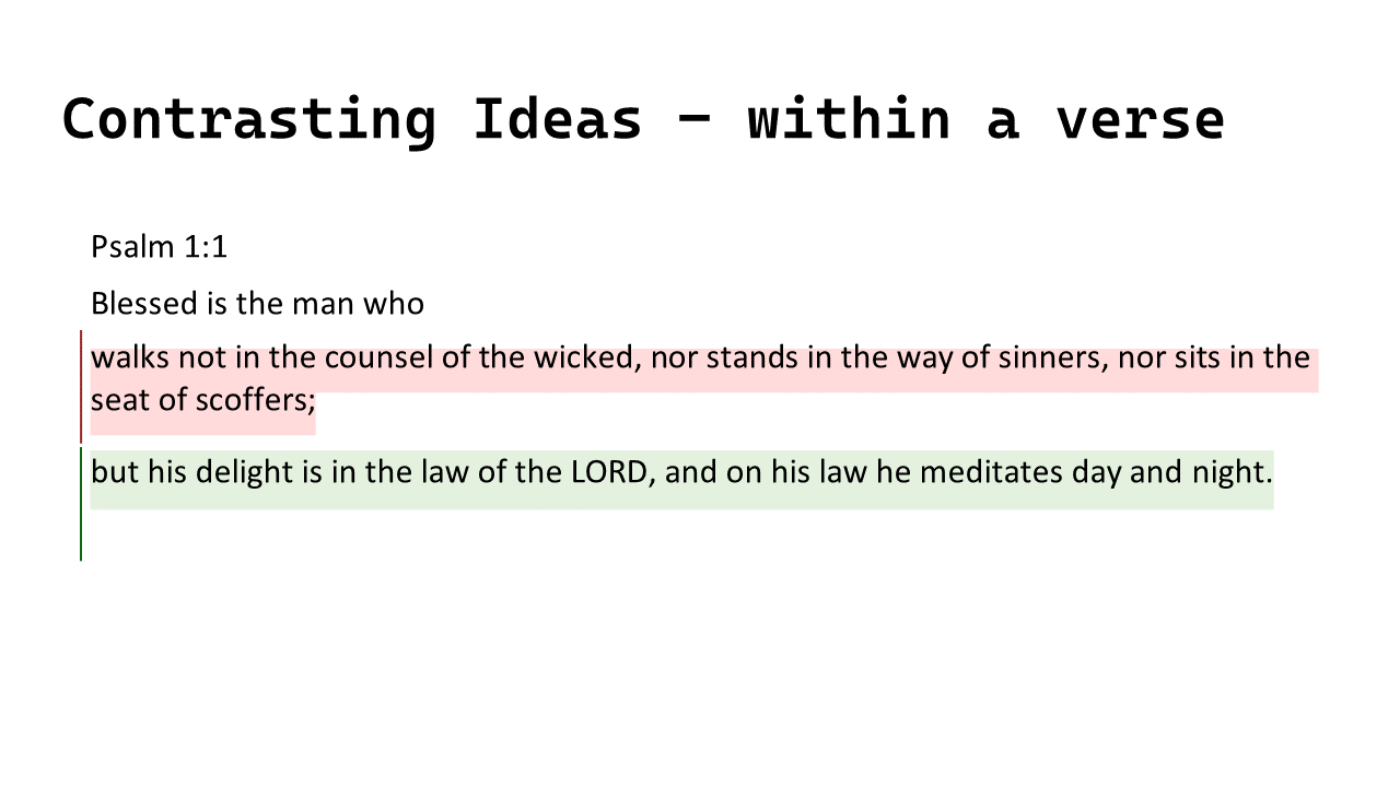
- Showing contrasting and separate ideas within a passage
To make it clear how parts of the text are different or refer to different ideas/concepts.
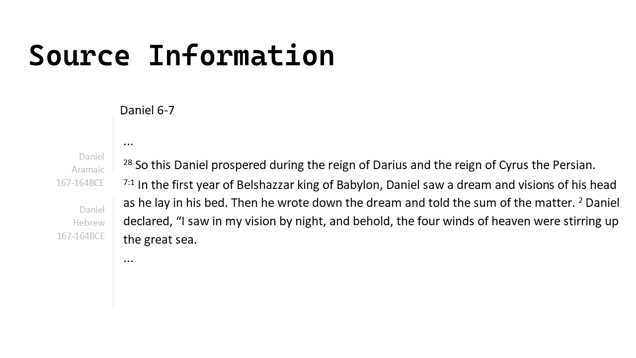
- Showing authoring details
Yes, like you might want to see who wrote different parts of a code base and when it was written.
- See structure that is lost in translation or with modern formatting conventions.
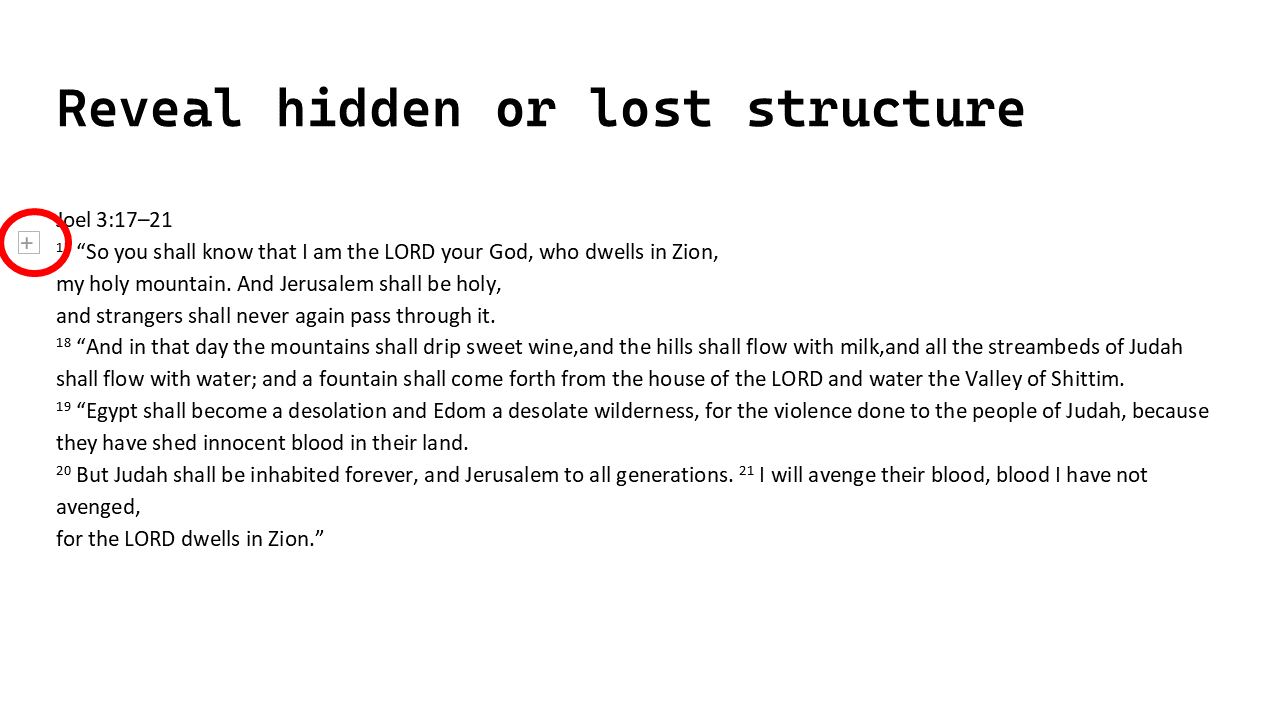
and when expanded:
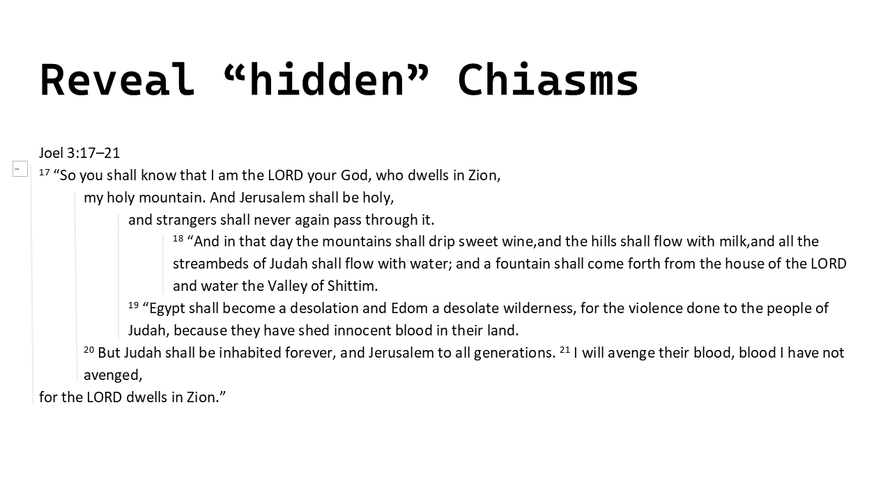
Translations
There are also many ways that the decisions of translators affect what we read and that can be useful to know or at least be aware of.
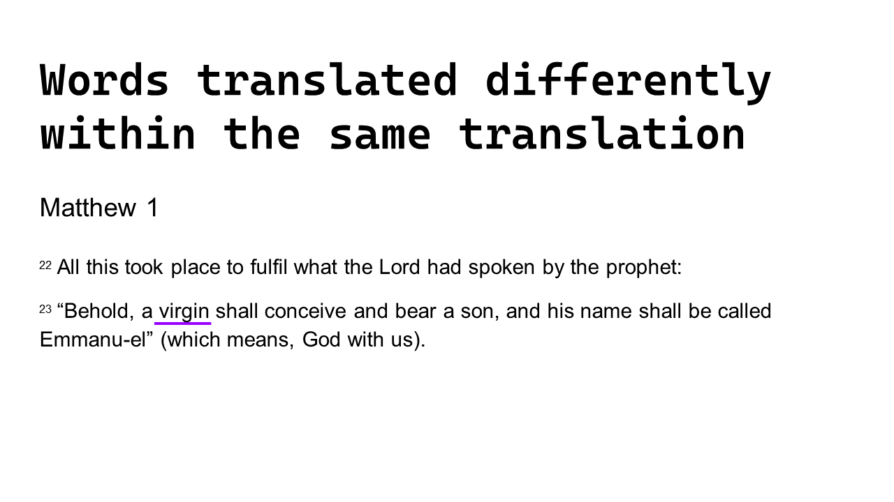
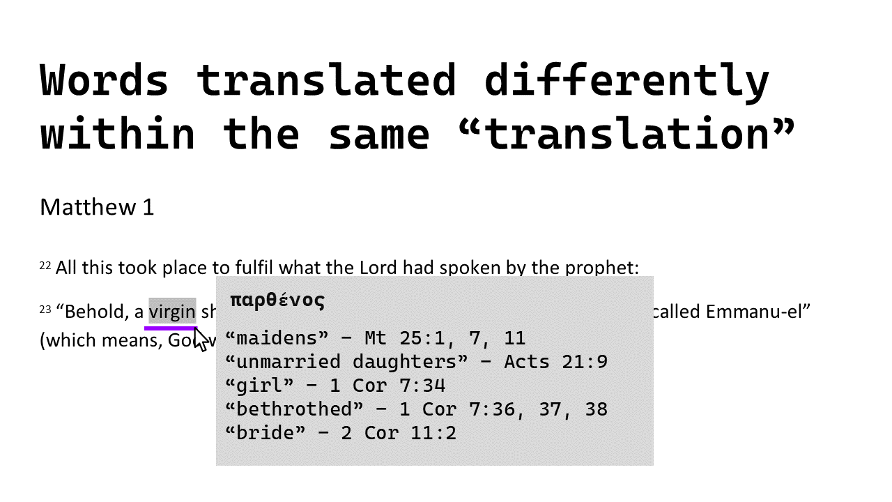
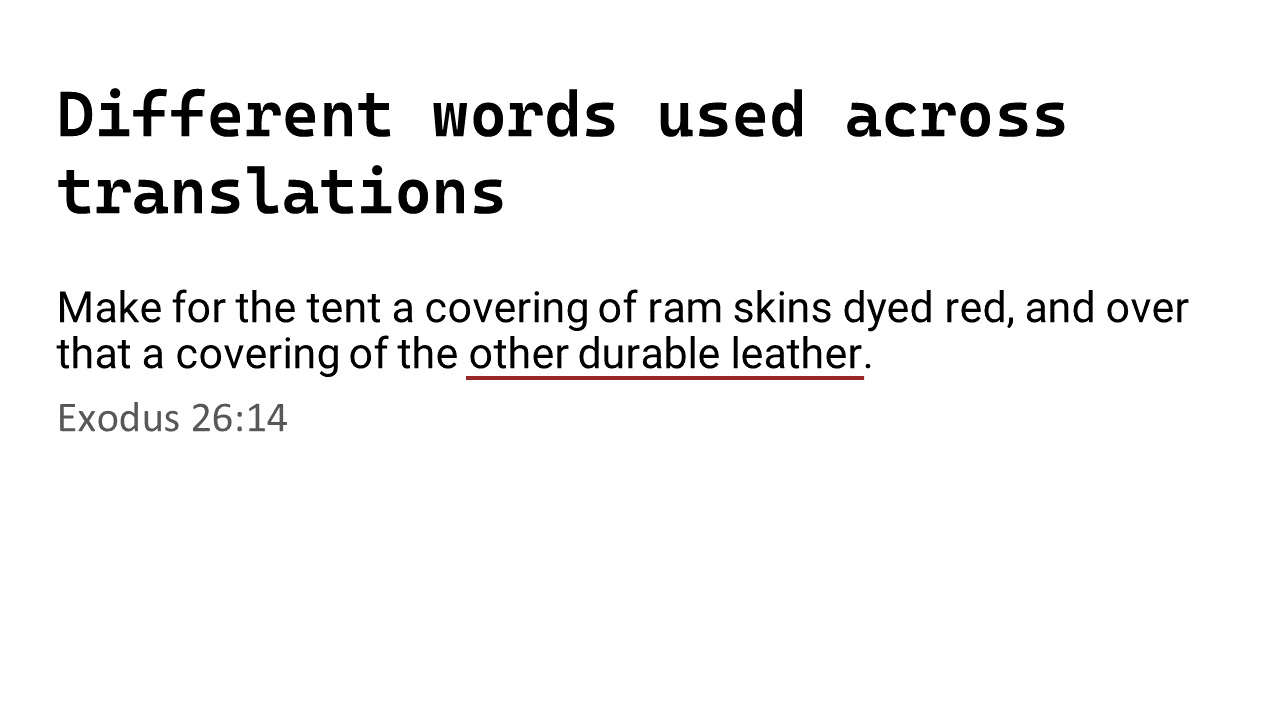
- Such as words translated differently in different parts of the text
A colored underline may be applied to such words.
An obvious example:
And with the details revealed (possibly by moving the cursor over the word)
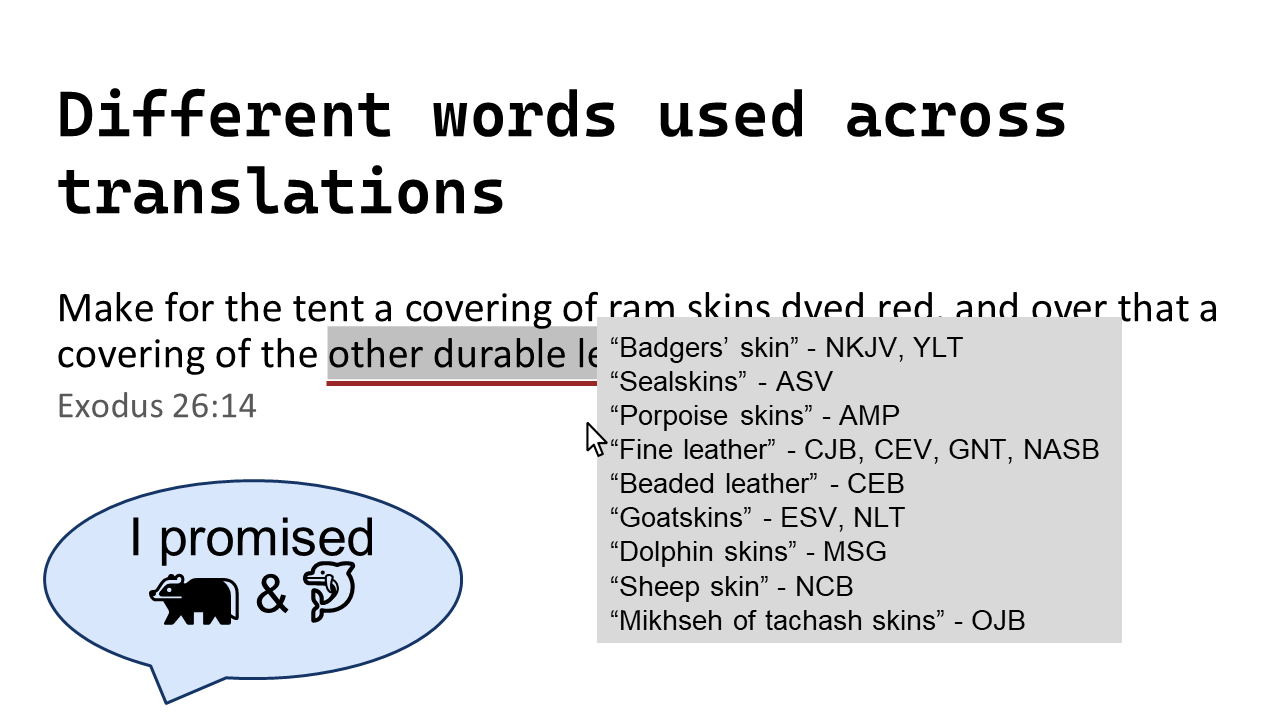
- Words translated differently by different translations of the bible
A different colored underline may be applied to such words.
And with the details revealed, all sorts of things (some possibly more useful than others) may be shown to the reader.
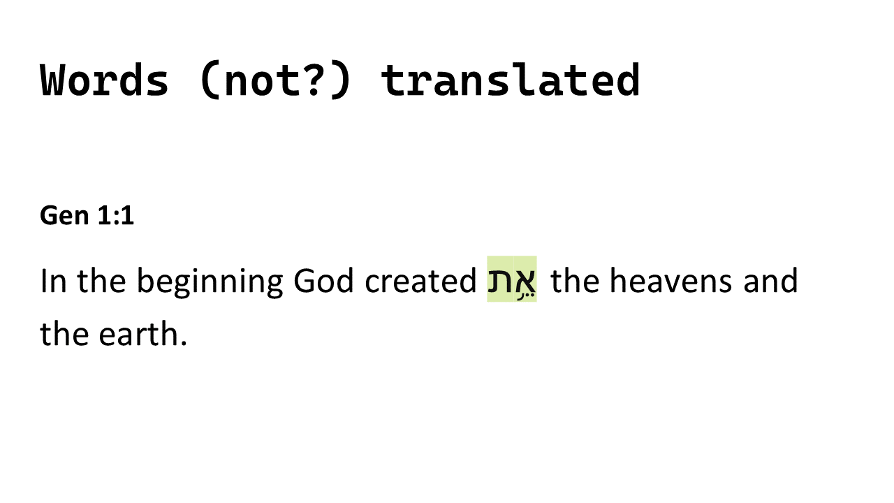
- Or words omitted from a translation
If you don’t know it’s not been translated you might be missing out on some valuable and insightful concepts and areas of study.
Navigation and Cross-referencing
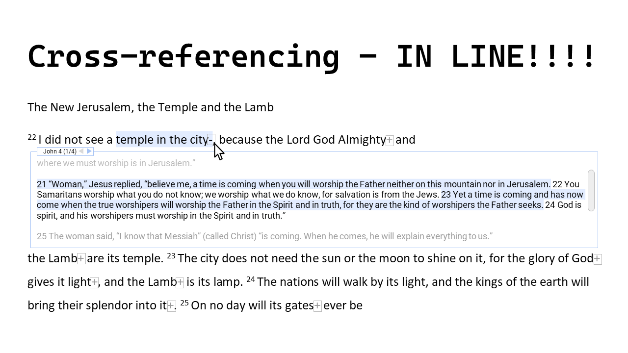
- Seeing things referenced elsewhere
Being able to see a related or referenced passage directly next to the first text can be much more useful than navigating away to another piece of text and away from the original context. And not just a single related verse. If showing a related verse, it should be possible to also access the verses around that verse too. If there are multiple related verses, then all should be accessible (readable) in the same way too.
- Loads of possibilities
We didn’t have the time to go deep on all the ideas we had, but here’s an indication of what some of the other possibilities are:
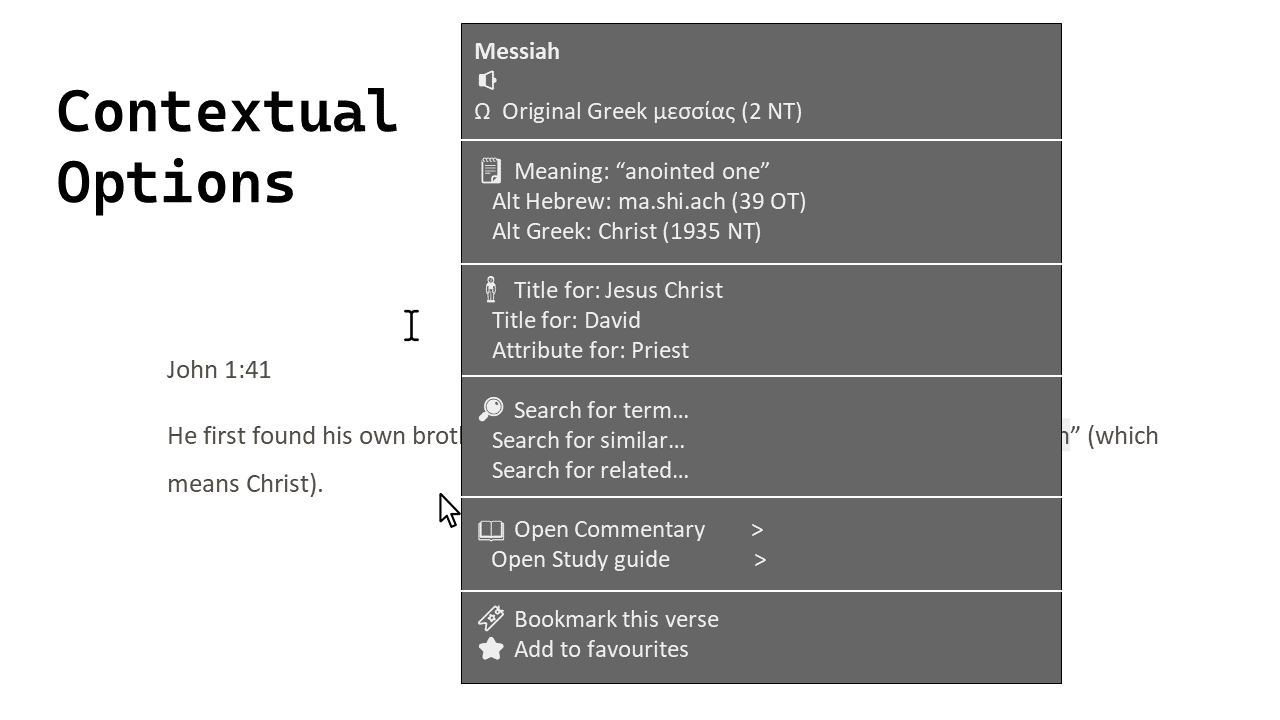
In summary
The above shows many ways that more information could easily be made available to help and inform the reader.
I’m not saying all are as valuable as each other or that all should even be included/supported.
Yes, there are different ideas above that would be impossible to include all of and trying to do so would undoubtedly make the text harder to read rather than easier.
It’s also expected that if some form of digital bible was created that included the above, there would need to be a way for the reader (user) to configure the options they would want included. How to handle such configuration has not been considered and can be discussed as and when it is necessary.
What next?
It’s a very good question. There’s apparent interest in being able to have something that provides at least some of the ideas we showed concepts for. However there are three big factors holding me back from investing in this further:
- This will be a massive amount of work that will take a long time, and I’m being kept very busy with other work at the moment.
- I don’t know where to begin in terms of sourcing and licensing adequate data, if it’s even available.
- I met people who work in the production of digital bibles who have had similar ideas but it was deemed not worth progressing with those ideas. I don’t know the full details or the reasons for the decisions but it doesn’t fill me with confidence that there’s a big demand for or interest in such tools.
Who knows what the coming year may bring…;)
Please consider sharing this with anyone you think would appreciate or benefit from it. twitter | facebook | LinkedIn | WhatsApp | reddit | email