Why are digital bibles like this?
![]() Oct 2023
Oct 2023
If you look at a bible on a digital device, be it phone, tablet, PC, or anything else, you’ll probably see something quite basic.
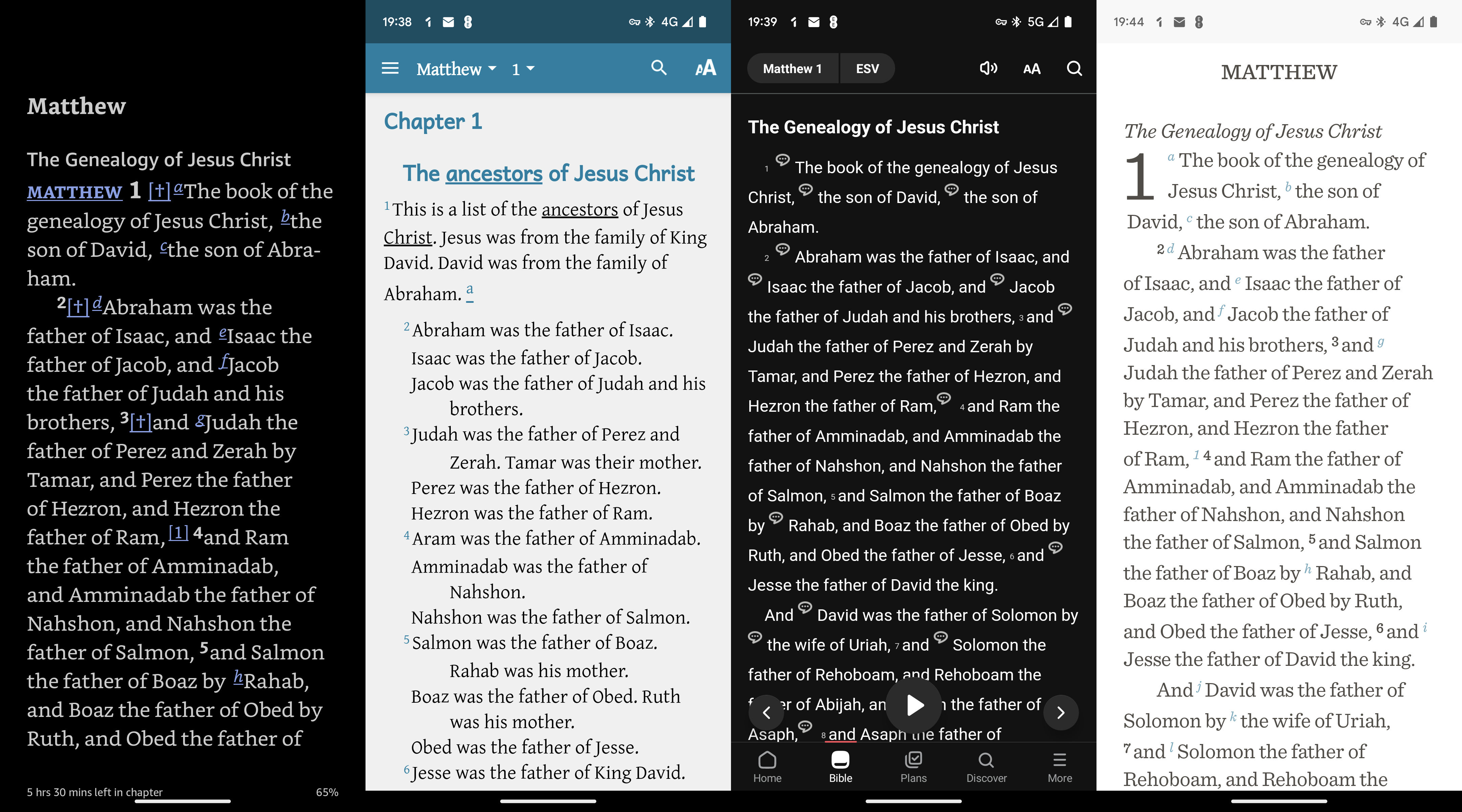
As an example, here are four apps (from my phone) showing the start of the book of Matthew. They show the text and a basic indication that there are cross-references or more details available if you click on an icon, hyperlink, or other-colored text.

It probably looks very like what you see in a printed version. Maybe the footnotes are shown as popups or there are hyperlinks to navigate between cross-references. But, it’s probably not what you’d call a sophisticated use of technology.
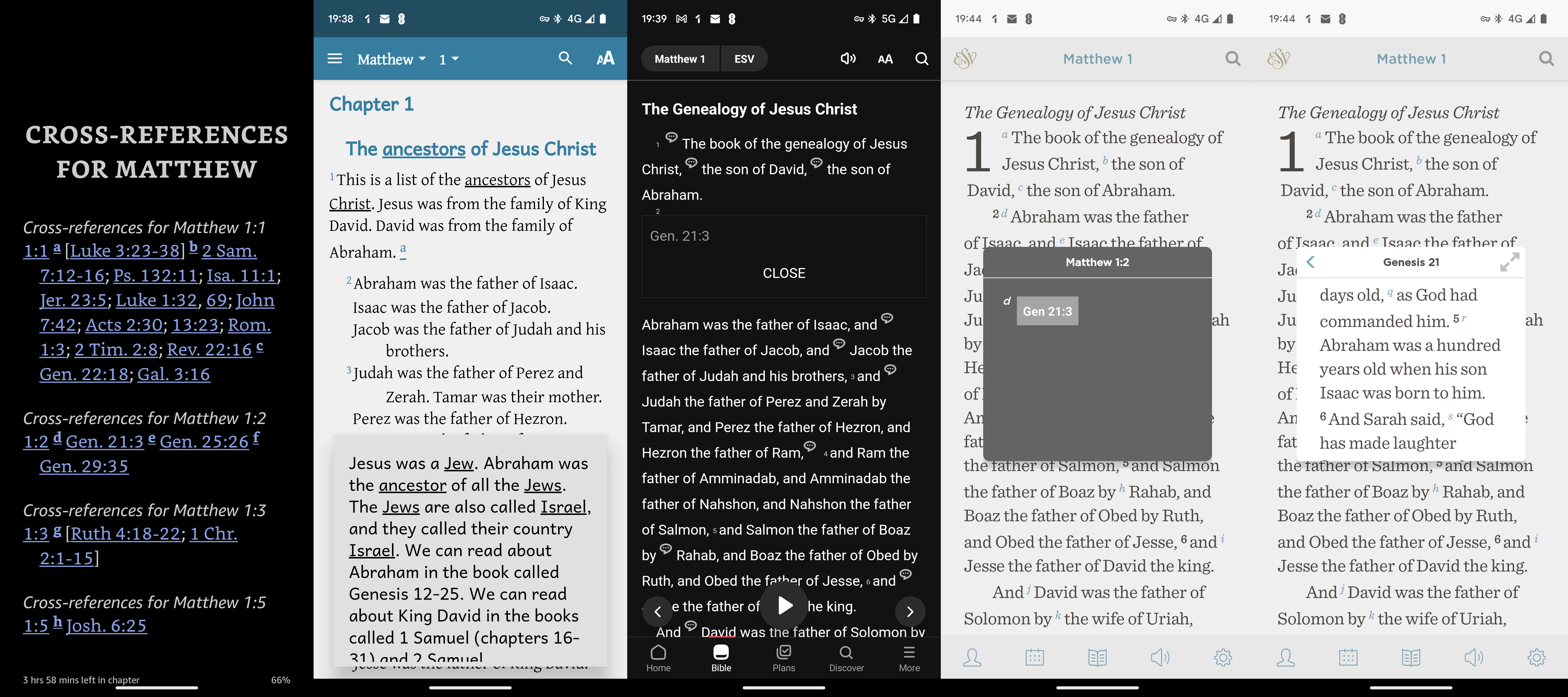
Here we see the above apps again, but this time showing what happens when you tap on one of those icons, links, or references. It either jumps to a list of links and so you lose the original context, or it shows a popup with a linked verse without it’s context.

Why shouldn’t a digital bible have a great digital user experience? Why can’t it have more advanced features that make it easier to read, understand, and navigate?
Yes, there is specialist software that has “advanced” search capabilities and reference material but is that pleasant and easy to work with? Does it look like it was built in this century? And does it help “regular” people who just want to read and understand the Bible more easily?
Why can’t digital bible’s be better?
Well, I think they can. Stay tuned….
Please consider sharing this with anyone you think would appreciate or benefit from it. twitter | facebook | LinkedIn | WhatsApp | reddit | email